Profile Maintenance Summary
This dashboard is designed for Regional and Site leaders, EHS managers, and compliance owners who are responsible for keeping site Applicability Profiles current and accurate.
What's in scope
The dashboard pulls from Applicability Profiles maintained in Dakota Profiler. Profiles under folders that do not have a site-level parent folder are excluded from every visualization.
A few terms used throughout this article:
Profile. An Applicability Profile in Dakota Profiler — a set of regulatory Subdomains assigned to a Facility, where each Subdomain has been marked Applicable, Unknown, or Not Applicable. Each Profile belongs to exactly one Facility, but a single Facility can have multiple Profiles.
Subdomain. The review unit within a Profile. Each Subdomain receives one of three applicability determinations: Applicable, Unknown, or Not Applicable.
Module / Primary Domain / Domain. Dakota's regulatory taxonomy is hierarchical. Module is the broadest level (equivalent to Domain Level 1 — e.g. Air Quality). Primary Domain is the next level down (e.g. Air Quality > Operating Permits). Subsequent Domain levels go deeper, with Domain L4 being the most specific level available for filtering on this dashboard.
Applicable / Unknown / Not Applicable. The three possible applicability statuses for a Subdomain. Not Applicable Subdomains are excluded from every metric on this dashboard — the visualizations are about active and outstanding scope, not about scope that has been ruled out.
For information on how data is synchronized from ProActivity into Insights, see Getting Started with Dakota Insights.
Filters
The Profile Maintenance Summary dashboard supports the following filter slicers:
Region
Business Unit
Facility
Module
Domain L4 (page 1 only)
Note: Unlike most Insights dashboards, Profile Maintenance Summary does not have a Date Range slicer. Every visual is a snapshot of the current state of your Profiles. There are no trend arrows on this dashboard.
For general guidance on using filters, see Filtering Dashboards in Dakota Insights.
Profile Maintenance Summary (page 1)
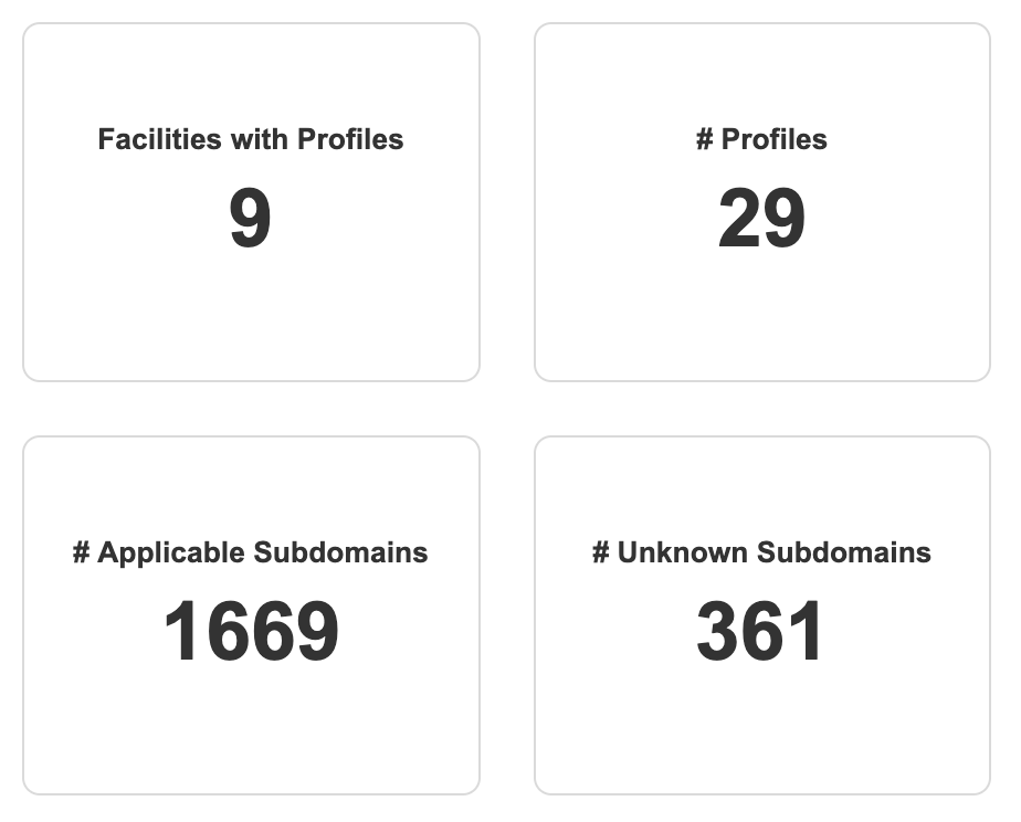
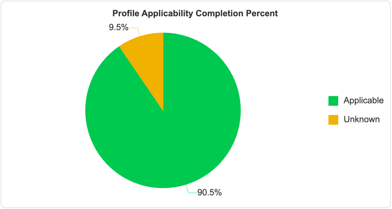
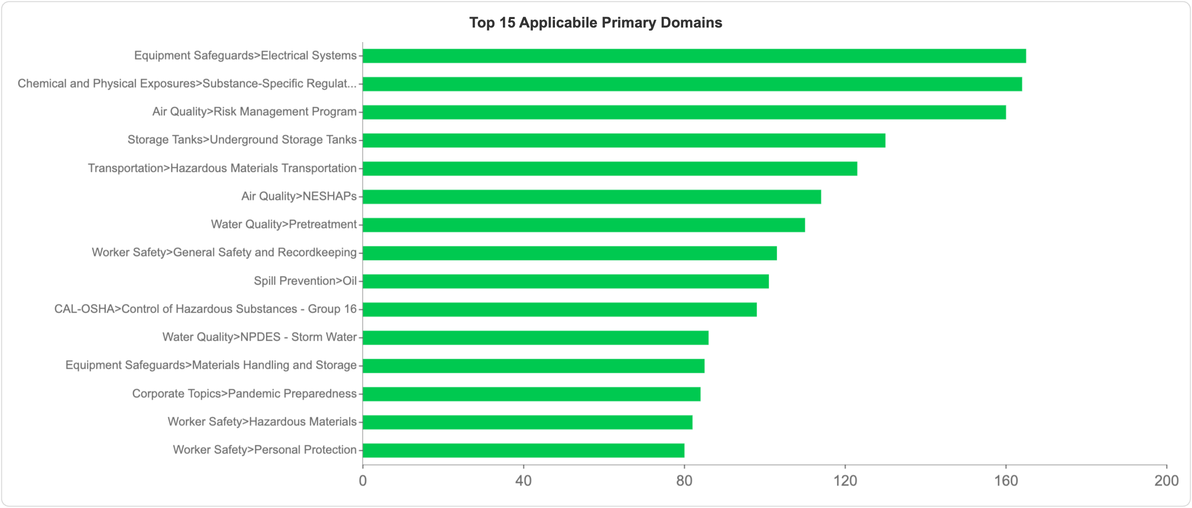
Page 1 gives you the organization-wide read on Profile health: four KPI tiles, a completion pie, and a Pareto chart of the regulatory Domains with the broadest applicability footprint.
 Profile Applicability KPIsTop-line KPIs
Each KPI tile shows a current value. There are no trend arrows on this dashboard because Profile data is a current-state snapshot rather than a time series.
# Profiles. Total count of Profiles across all facilities. A volume indicator for the compliance team's workload and for the breadth of the organization's regulatory footprint.
# Applicable Subdomains. Count of Subdomains across all Profiles that have been reviewed and marked Applicable. Measures the regulatory scope the organization is actively tracking — the larger this number, the more compliance obligations are under active management.
# Unknown Subdomains. Count of Subdomains across all Profiles whose applicability has not yet been determined. A high count suggests Profile setup is incomplete, meaning the organization may be overlooking compliance obligations.
Profile completeness and regulatory footprint
Two visuals round out the Page 1 view.
Profile Applicability Completion Percent (pie). Share of Subdomains marked Applicable versus Unknown. A high Applicable share means the compliance picture is current and trustworthy; a large Unknown share means compliance may be under-specified. Not Applicable Subdomains are excluded from the denominator.
Top 15 Applicable Primary Domains. A horizontal bar chart, Pareto sorted, showing the fifteen Primary Domains with the highest count of Applicable Subdomains across the organization. Identifies the regulatory areas with the broadest compliance reach — focusing attention on where training, programs, and tasks may have the greatest organization-wide impact. Labels are shown in Module > Domain format.
 Overall profile review
 Which regulatory Domains are most widely applicable across the organization?
Profile Maintenance Summary by Facility (page 2)
Page 2 takes the same Profile data and slices it by Facility, so you can see which sites have the largest Profiles, which are most thoroughly reviewed, and where Unknown determinations are concentrated.
Note: Page 2 does not include the Domain L4 filter that appears on page 1. For organizations with very many (e.g. 50+) facilities, the per-facility charts may be crowded; use Region, Business Unit, or Module filters to focus on a subset.
Percent Applicability Completion by Facility. A 100% stacked horizontal bar chart showing the share of Applicable versus Unknown Subdomains at each Facility, normalized to 100% per bar. Highlights facilities falling behind on Profile maintenance regardless of the absolute size of their Profiles — useful for spotting lagging facilities at a glance.
Applicability Completion by Facility. A stacked horizontal bar chart showing the absolute count of Applicable versus Unknown Subdomains at each Facility. Complements the percent-normalized chart above by showing the actual scale of each facility's Profile and how many Subdomains still need review.
Profile Maintenance Counts by Facility, Name and Primary Domain (table). A hierarchical table with columns for Facility, Profile Name, Primary Domain, Applicable, Unknown, and Total, with a Total row at the bottom. Supports expand/collapse at the Facility level. Provides the drill-down needed to assign review work — pinpointing which specific Profile and Primary Domain at which Facility has outstanding applicability determinations. If you have more than about 30 facilities, export the full table to view all rows.
Refresh and data freshness
The data in this dashboard refreshes every four hours. For details on synchronization timing and what's included from each ProActivity product, see Getting Started with Dakota Insights.
Related Articles
Audit Summary
The Audit Summary Insights dashboard helps you see how your audit program is performing — how many audits you're completing, how long they're taking, where compliance concerns are concentrated, and what your potential financial exposure looks like. ...Injury and Illness Incident Summary
The Injury and Illness Incident Summary Insights dashboard helps you see how your organization is performing on injury and illness — the headline OSHA rates, severity, the nature and cause of injuries, and where they happen — and gives you everything ...Organizational Health
The Organizational Health Insights dashboard gives you an executive overview of your EHS program in a single glance — recent injury experience, multi-year injury trends, regulatory profile completeness, task follow-through, and audit findings — and ...Near Miss Summary
The Near Miss Summary Insights dashboard helps you see how well your near-miss reporting program is working — how many near misses are being reported, what potential consequences they would have had, and whether the volume of near misses is keeping ...Add an Alert to KPI
You can set up email alerts to get notified when a KPI value on the dashboard reaches a particular threshold. You will be sent an email alert when the threshold is met. To set your alert for a particular KPI: Select the dashboard you want to set a ...